
Part 1 of three. This one covers the gesture system, spring physics, peel-off animation, and die-cut rendering. Part 2 gets into the holographic shader, tilt sensing, haptics, and cross-platform architecture.
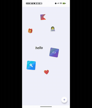
I built a sticker canvas app. You slap stickers on a surface, drag them around, pinch to resize, rotate with two fingers, and when you grab one it peels up like you're lifting real vinyl off a sheet. There's a holographic shimmer that responds to your phone's tilt, spring physics on everything, haptic feedback on every interaction.
I was watching Apple's WWDC sticker segment and thinking about how good the peel-and-stick interactions felt. Then I saw this tweet by Daniel Korpai:
Sticker Wall – Playing with SwiftUI for the first time trying to recreate @Apple iMessage holo stickers 😍
— Daniel Korpai (@danielkorpai) May 2, 2024
Huge thank you for @philipcdavis for his incredible course, @jmtrivedi and @alexwidua for the open source projects and @Gavmn for the inspiring prototypes! 🙌🔥 pic.twitter.com/mYI9aoyd7q
And I thought: can I build that in Compose? Not a static grid. Something where stickers feel like physical objects you can grab, lift, and stick down. Shadows that grow as they rise. Shimmer when you tilt the phone.
It also felt like the right project to push Compose Multiplatform past the usual form-app demos. I wanted to hit the hard parts: platform sensors, native haptics, custom shaders, layered gestures. All shared between Android and iOS.
What it actually does
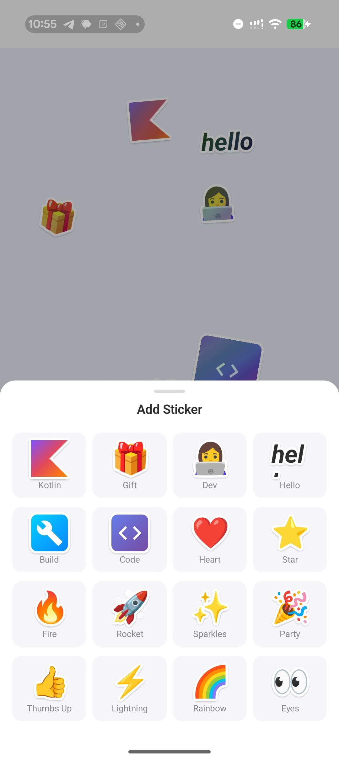
Tap the + button, and a bottom sheet slides up with 16 stickers: Emoji, text, Canvas-drawn shapes, Material icons on gradient backgrounds. Pick one, and it drops onto the canvas at a random position with a slight rotation.
From there, you can drag with one finger, pinch to resize (0.5x to 3x), rotate with two fingers, tap to bring a sticker to the front, or double-tap for a bouncy 2x zoom. Grab and release to feel the peel-off with haptics.
Every sticker has a white die-cut border (like a real vinyl sticker), a dynamic drop shadow that grows when you lift it, and an iridescent holographic shimmer that shifts as you tilt your phone.
There's also a history screen that logs every sticker you've placed, with relative timestamps. The entire canvas state (positions, rotations, scales, z-ordering, history) persists across app launches.
Tech stack
I kept the dependencies minimal:
| Library | What it does |
|---|---|
| Compose Multiplatform 1.7 | UI across Android and iOS |
| Navigation Compose | Two screens: canvas and history |
| Lifecycle ViewModel | Shared state management with coroutine scope |
| DataStore Preferences | Persistence across launches |
| kotlinx.serialization | JSON for canvas state |
| Material 3 | Bottom sheet, FABs, top bar, icons |
No image loading library. No third-party gesture library. No external animation framework. Every sticker is rendered with pure Compose: Text for emoji, Canvas for the Kotlin logo path, Icon in a gradient Box for the tool stickers. Zero image assets to manage.
Architecture at a glance
The architecture is simple on purpose. One CanvasViewModel owns two StateFlows, one for the sticker list and one for the history log. A CanvasRepository wraps DataStore for persistence. The view model loads saved state on init and debounce-saves after every change.
commonMain/
  App.kt                    -- NavHost with two routes
  StickerCanvas.kt          -- Canvas composable with draggable stickers
  StickerTray.kt            -- Bottom sheet picker
  ShimmerGlow.kt            -- Holographic modifier node
  HistoryScreen.kt          -- History log
  model/                    -- StickerItem, StickerType, HistoryEntry
  data/                     -- CanvasRepository, DataStore factory
  viewmodel/                -- CanvasViewModel
  sensor/                   -- TiltSensor expect/actual
  haptics/                  -- HapticFeedback expect/actual

androidMain/                -- SensorManager, View haptics, AGSL shader
iosMain/                    -- CMMotionManager, UIKit haptics, fallback shader
Five expect/actual boundaries handle the platform differences:
- Tilt sensors (Android SensorManager vs iOS CMMotionManager)
- Haptic feedback (Android View.performHapticFeedback vs iOS UIImpactFeedbackGenerator)
- Holographic rendering (AGSL shader on Android 13+ vs ShaderBrush fallback)
- DataStore file paths
- System clock
The common code never imports anything from Android or iOS. Each platform implementation is a thin wrapper around native APIs.
The sticker data model
Each sticker on the canvas is a data class:
@Serializable
data class StickerItem(
    val id: Int,
    val type: StickerType,
    val initialFractionX: Float,
    val initialFractionY: Float,
    val rotation: Float = 0f,
    val offsetX: Float = Float.NaN,
    val offsetY: Float = Float.NaN,
    val pinchScale: Float = 1f,
    val zIndex: Float = 0f,
)
New stickers start with fractional coordinates (0..1 relative to canvas size) so the default layout works on any screen. Once you drag a sticker, pixel offsets take over. The composable checks for Float.NaN on first render to decide which positioning to use.
Z-ordering is a monotonically increasing counter. Tap a sticker and it gets the next value. Compose's .zIndex() modifier handles the rest.
What's coming in Part 2
Part 2 goes deep on two features: the peel-off grab (spring physics, dynamic shadows, layered gesture handling) and the holographic shimmer (thin-film optics, AGSL shader, cross-platform fallback).
Read Part 2: The peel-off effect and holographic shimmer
Built with Kotlin 2.1 and Compose Multiplatform 1.7.