
Compose just got a styling system. A first-party API in Foundation that replaces InteractionSource boilerplate with declarative style blocks. Here's what three days of testing it looked like.
Demo repo: https://github.com/aldefy/compose-style-lab — 8 interactive labs, clone and run.
Where we are today in terms of compose API?
Every Compose developer knows this ritual. You want a button that shrinks and changes color when pressed. Nothing exotic. Here is what you write today:
val interactionSource = remember { MutableInteractionSource() }
val isPressed by interactionSource.collectIsPressedAsState()
val backgroundColor by animateColorAsState(
    if (isPressed) pressedColor else defaultColor
)
val scale by animateFloatAsState(if (isPressed) 0.95f else 1f)
Box(
    modifier = Modifier
        .graphicsLayer { scaleX = scale; scaleY = scale }
        .background(backgroundColor, RoundedCornerShape(16.dp))
        .clickable(interactionSource = interactionSource, indication = null) { }
)
Five declarations, three state subscriptions, and a graphicsLayer to get a scale animation that CSS handles with transition: transform 0.2s.
Styles API is awesome 🙌🏼


Now here is the same behavior with the Styles API, which shipped in compose-foundation:1.11.0-alpha06 on February 25, 2026
val style = Style {
      background(defaultColor)
      shape(RoundedCornerShape(16.dp))
      pressed { animate { background(pressedColor); scale(0.95f) } }
  }
  Box(Modifier.styleable(style = style))
One declarative definition. No animateAsState. No graphicsLayer. (This is simplified — in alpha06 you still need a MutableStyleState with a shared InteractionSource for pressed detection. Lab 3 covers the full pattern.) I spent three days building a demo app with eight lab screens to figure out what this API actually delivers, where it falls short, and what it means for how we build components. This is what I found.
How Compose handles styling today
Compose's existing styling story is fine for simple cases. You set a background color. You pick a shape. You move on. The friction starts the moment you need visual responses to interaction state.
InteractionSource is the mechanism. You create one, wire it into your clickable or toggleable modifier, then collect flows like collectIsPressedAsState(), collectIsHoveredAsState(), or collectIsFocusedAsState(). Each flow gives you a boolean. You map those booleans to visual properties using animateColorAsState, animateFloatAsState, or animateDpAsState. Then you feed the animated values into the right modifiers: background(), graphicsLayer {}, border().
It works. It is also completely manual. There is no reusable "style object" you can define once and apply to multiple components. If three buttons share the same pressed behavior, you copy-paste the InteractionSource plumbing three times or extract a custom composable. Want to share that behavior? You write a helper function that returns a Modifier, but then you lose the ability to override individual properties without rewriting the whole chain. There is no composition mechanism. You cannot take a "base card style" and layer a "dark theme style" on top of it. You just write more modifiers and hope the ordering is right.
State-driven visual changes get worse at scale. A card that looks different when selected, disabled, and pressed needs a when block or a series of if checks to compute each visual property. The logic scatters across the composable function. You end up with five animateXAsState declarations, three boolean state collectors, and a graphicsLayer block for the transforms. Six months later, a new team member reads the code and has to reconstruct which visual properties change in which states mentally. The intent is buried under plumbing.
These are not hypothetical complaints. I have shipped production apps where the styling logic for a single component was longer than the layout logic. Components that should have been twenty lines ballooned to sixty because each interaction state needed its own animation pipeline. It felt wrong every time.
When I saw compose-foundation:1.11.0-alpha06 land on February 25, 2026, with the @ExperimentalFoundationStyleApi annotation and roughly fifty new style properties, I wanted to find out what it actually delivers. Not the API docs. The real behavior on a device.
Building Compose Style Lab
I built Compose Style Lab, an Android app with eight interactive lab screens. Each lab isolates a specific part of the Styles API: interaction states, composition, state driving, transforms, micro-interactions, text styling, theme integration, and custom component patterns.
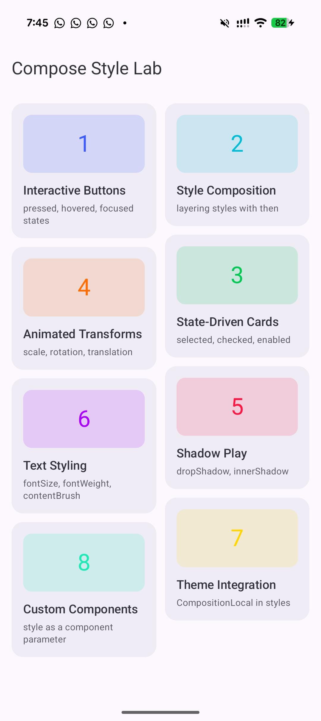
The labs are progressive. Lab 1 is a pressed button. Lab 8 is a full-component API that follows the pattern the Compose team recommends. Every lab has live toggles so you can flip states and watch the style respond in real time. No static screenshots pretending to be demos. I also added property readouts that display the current resolved values of the style properties, so you can see exactly what the style system is doing at any moment.
The goal was not to build a polished app. It was to find the edges of the API. What works as documented? What silently fails? What patterns will scale when this reaches stable?
Before getting into the labs:
Here is the 30-second API overview. The Style {} block is a builder where you set visual properties: background(), shape(), contentPadding(), scale(), borderWidth(), contentColor(), fontSize(), and about forty more. State blocks like pressed(), hovered(), focused(), selected(), checked(), and disabled() each accept another Style that activates when the component enters that state. Wrap a state style in animate() and the transitions are smooth. Apply the whole thing with Modifier.styleable(style = myStyle). That is the entire model.
Now, eight labs. Eight lessons.
8 labs, 8 lessons
Lab 1: Interaction states without the boilerplate
One Style handles pressed, hovered, and focused with animation.
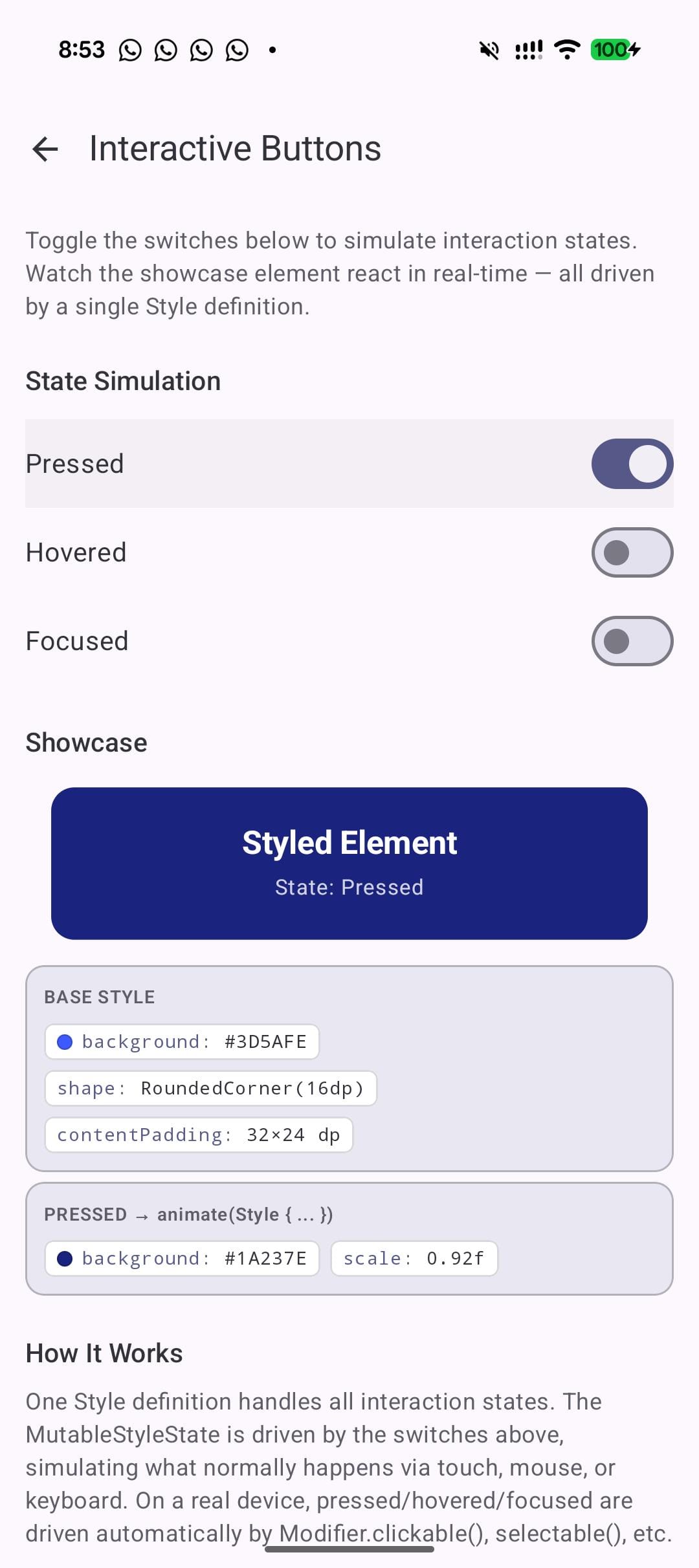
This is where I started. A single composable that responds to pressed, hovered, and focused states, all defined in one Style block:
val showcaseStyle = Style {
      background(baseColor)
      shape(RoundedCornerShape(16.dp))
      contentPadding(horizontal = 32.dp, vertical = 24.dp)
      pressed {
          animate {
              background(Color(0xFF1A237E))
              scale(0.92f)
          }
      }
      hovered {
          animate {
              background(Color(0xFF536DFE))
              scale(1.04f)
              borderWidth(2.dp)
              borderColor(Color.White.copy(alpha = 0.5f))
          }
      }
      focused {
          animate {
              borderWidth(3.dp)
              borderColor(Color.White)
              background(Color(0xFF304FFE))
          }
      }
  }
The thing I noticed right away is the structure. Each state is a named block. Each block contains exactly the properties that change. The animate() wrapper means those changes transition smoothly. Reading this code six months from now, you know exactly what the component looks like in every state without tracing through boolean variables and animateAsState calls.
What you learn:
pressed(),hovered(),focused()each take a Style argument. Since Style is a fun interface, bothpressed(Style { ... })and the trailing lambdapressed { ... }work - use whichever reads best in context.- Wrap state styles in
animate()for smooth transitions. Without it, property changes are instant. - One definition replaces the entire InteractionSource + collectAsState + animateColorAsState + graphicsLayer chain.
Lab 2: Composing styles like modifiers
Build reusable style layers and compose them with .then().
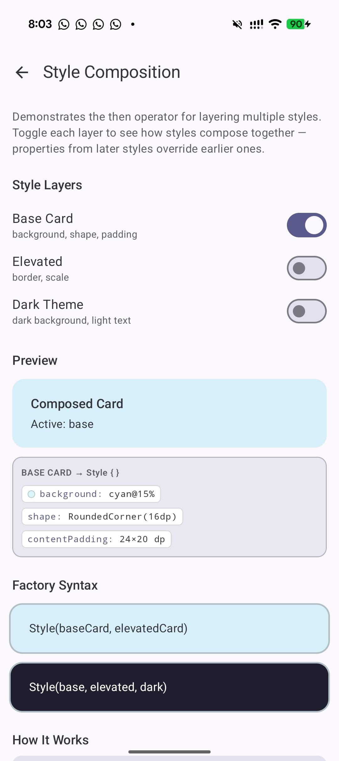
This lab explores what I think is the real long-term win of the API: composition. You define small, focused styles and combine them.
val baseCard = Style {
    background(LabCyan.copy(alpha = 0.15f))
    shape(RoundedCornerShape(16.dp))
    contentPadding(horizontal = 24.dp, vertical = 20.dp)
}
val elevatedCard = Style {
    borderWidth(2.dp)
    borderColor(Color(0xFFB0BEC5))
    scale(1.02f)
}
val darkTheme = Style {
    background(Color(0xFF1E1E2E))
    contentColor(Color.White)
}

// Later styles override earlier ones:
val composed = baseCard.then(elevatedCard).then(darkTheme)
The .then() operator works like Modifier chaining. Properties from later styles override those from earlier styles. In the example above, darkTheme overrides the background from baseCard, but the shape from baseCard and the border from elevatedCard both survive. This is exactly how CSS specificity works, except here it is explicit and ordered. No cascade confusion. No !important.
You can also use the factory form Style(s1, s2, s3) if you prefer a flat call over a chain. The merge behavior is identical.
If you are building a design system, this is the pattern to pay attention to. Define your spacing tokens as one style, your color tokens as another, your elevation tokens as a third. Compose them per component. When the design team changes the spacing scale, update one style definition and every component that uses it updates. This is the kind of reuse that Compose's modifier system never cleanly supported.
What you learn:
.then()works like Modifier chaining. Later properties override earlier ones.Style(s1, s2, s3)factory is an alternative to chaining when you already have all the pieces.- This enables design tokens. Define a
baseCard,elevation, andthemestyle once. Compose them per screen. Change the base and every composed style updates.
Lab 3: Driving visual state declaratively
selected(), checked(), and disabled() with explicit state driving.
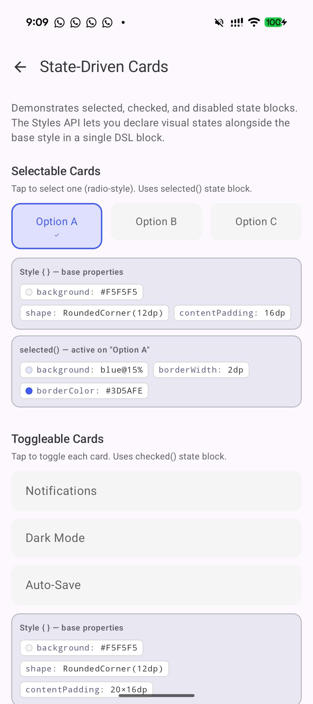
Labs 1 and 2 felt smooth. Lab 3 is where I hit the wall. I defined disabled() and checked() state blocks, applied them with Modifier.styleable(style = ...), and nothing happened. Tapping a toggle did not change the visual state. The style just sat there showing defaults.
The manual wiring is intentional — earlier versions had auto-detection but it conflicted with the interactionSource on clickable/toggleable.
val cardStyle = Style {
      background(AccentOrange.copy(alpha = 0.15f))
      shape(RoundedCornerShape(12.dp))
      borderWidth(2.dp)
      borderColor(AccentOrange)
      disabled {
          background(Color(0xFFE0E0E0))
          contentColor(Color(0xFF9E9E9E))
          scale(0.98f)
      }
}

// Explicit state driving:
  val styleState = remember { MutableStyleState(interactionSource) }
  styleState.isEnabled = enabled
  Box(Modifier.styleable(styleState = styleState, style = cardStyle))
Once I switched to this pattern, everything worked. Selected cards highlighted. Disabled cards grayed out. Checked toggles animated.
What you learn:
selected(),checked(),disabled()are state blocks just likepressed().- State is driven explicitly via
MutableStyleState. You setstyleState.isChecked,styleState.isEnabled,styleState.isSelectedyourself.
Gotcha: Modifier.styleable(style = ...) alone does not detect state from toggleable() or clickable(). You must use MutableStyleState and drive state explicitly. This is by design, not a bug. The clickable/interactionSource/ripple integration is being reworked, so expect this pattern to evolve
Lab 4: Animated transforms in 3 lines
scale(), rotationZ(), and translationX/Y() inside animate blocks.
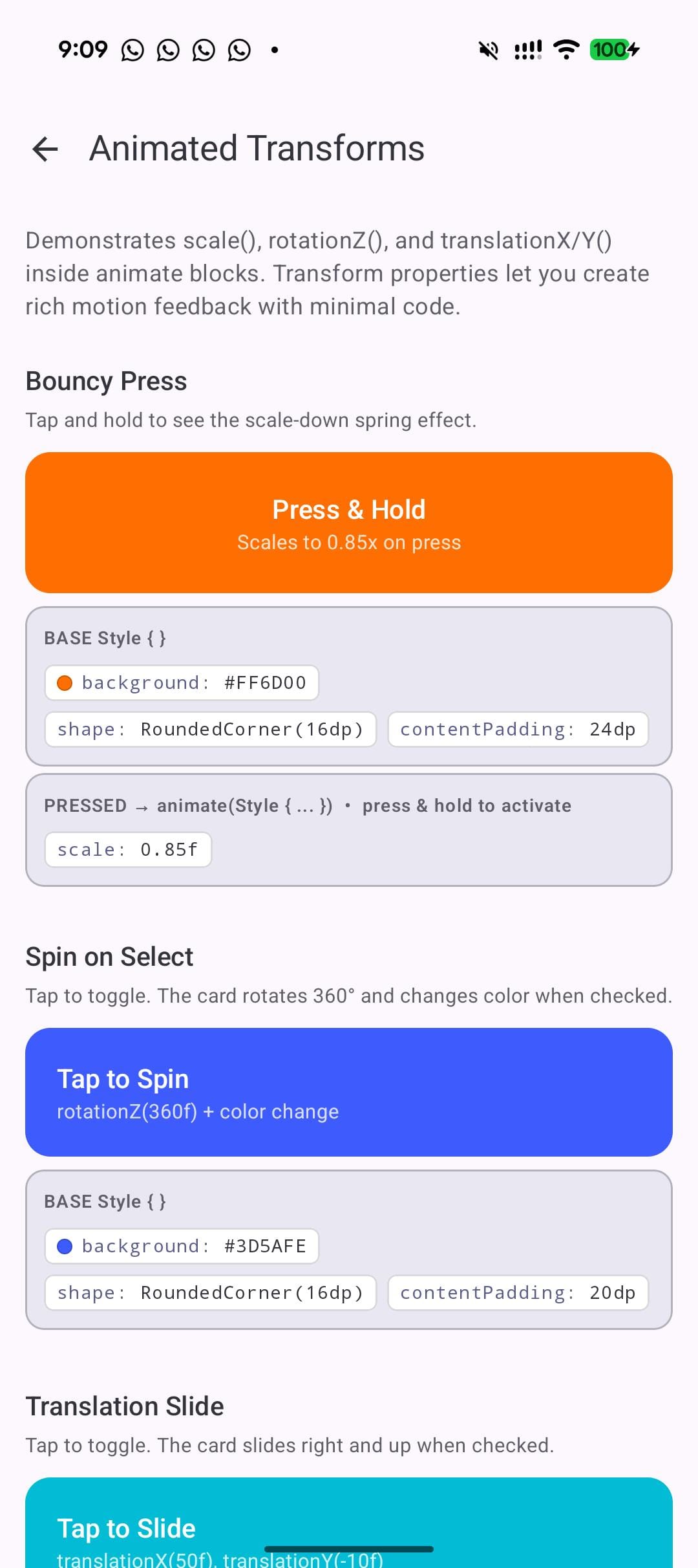
This lab explores the transform properties. In current Compose, any transform requires graphicsLayer {}. With Styles, transforms are just properties.
val spinStyle = Style {
      background(Color(0xFF3D5AFE))
      shape(RoundedCornerShape(16.dp))
      contentPadding(20.dp)
      checked {
          animate {
              rotationZ(360f)
              background(Color(0xFF00C853))
          }
      }
  }

  val slideStyle = Style {
      background(Color(0xFF00BCD4))
      shape(RoundedCornerShape(16.dp))
      contentPadding(20.dp)
      checked {
          animate {
              translationX(50f)
              translationY(-10f)
          }
      }
  }
Toggle the checked state and the first box spins 360 degrees while changing from blue to green. The second slides 50px right and 10px up. Both animate smoothly because of the animate() wrapper. No graphicsLayer. No animateFloatAsState. Three lines of transform code.
The brevity is nice, but colocation is the real win. The transform, the color change, and the trigger condition all live in the same block. In the old approach, the rotation lives in a graphicsLayer, the color lives in a background() modifier, and the state check lives in a collectAsState call. Three different locations for one visual behavior. Here it is one nested block.
What you learn:
- Transform properties (
scale,rotationZ,translationX,translationY) work insideanimate()just like color and shape properties. - No
graphicsLayerneeded. The Style system handles the layer internally. - You can combine transforms with color changes in a single state block. The spin and the color change happen together, no extra wiring.
Lab 5: Real-world micro-interactions
Favorite buttons, nav bars, pill toggles: practical patterns.
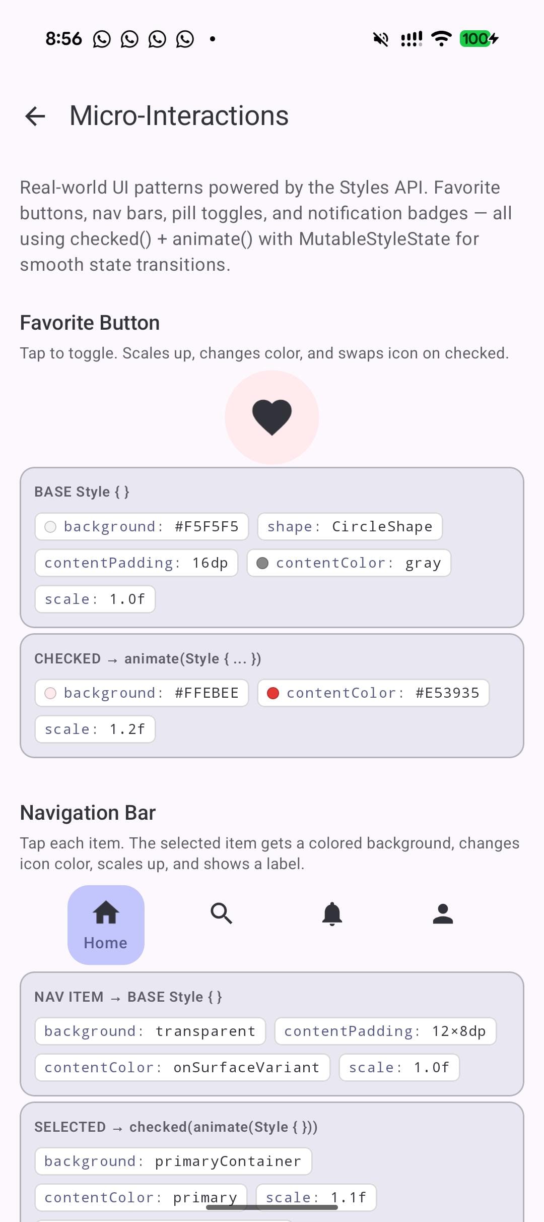
Labs 1 through 4 are isolated concepts. Lab 5 applies them to real UI patterns. The favorite button is the most satisfying one to tap:
 val favoriteStyle = Style {
      background(Color(0xFFF5F5F5))
      shape(CircleShape)
      contentPadding(16.dp)
      contentColor(Color.Gray)
      checked {
          animate {
              background(Color(0xFFFFEBEE))
              contentColor(Color(0xFFE53935))
              scale(1.2f)
          }
      }
  }
Tap the heart. The background warms to pink, the icon turns red, and the whole thing scales up 20%. Tap again and it shrinks back to gray. The contentColor() property is doing something important here: it propagates to child Text and Icon composables through CompositionLocal. You set the color on the container, and the icon inside picks it up automatically.
This same pattern extends to navigation bar items, pill-shaped toggle buttons, and notification badges. Define the default state, define the active state with checked() or selected(), wrap in animate(). Done.
What you learn:
contentColor()propagates to childTextandIconcomposables viaCompositionLocal. Set it on the parent and children inherit it.CircleShapecombined withscale()creates satisfying micro-interactions with minimal code.- The same checked/selected pattern works for nav bar items, toggle pills, and notification badges.
Lab 6: Text properties you didn't know you could style
fontSize(), fontWeight(), contentBrush(), letterSpacing(), and textDecoration().
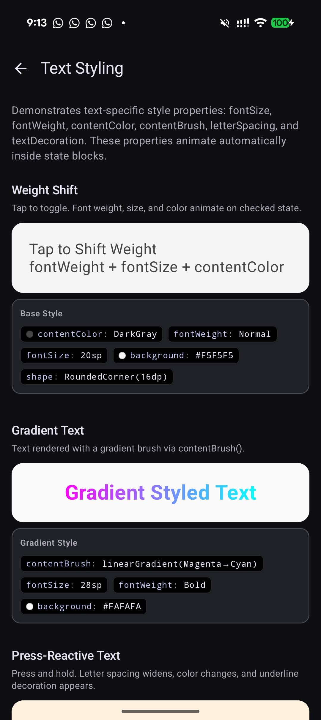
I did not expect the Styles API to cover text properties, but it does. Some of them surprised me.
val pressTextStyle = Style {
      contentColor(Color.Black)
      fontSize(18.sp)
      letterSpacing(0.sp)
      pressed {
          animate {
              contentColor(Color(0xFFFF6D00))
              letterSpacing(4.sp)
              textDecoration(TextDecoration.Underline)
              scale(0.96f)
          }
      }
  }

  val gradientStyle = Style {
      contentBrush(Brush.linearGradient(listOf(Color.Magenta, Color.Cyan)))
      fontSize(28.sp)
      fontWeight(FontWeight.Bold)
  }
The first style makes text spread its letters apart and underline when pressed. It looks good. The second applies a gradient brush to the text. No custom drawBehind or TextStyle with Brush. Just contentBrush() in the style block.
letterSpacing() animating on press is a subtle effect that feels premium. I had never seen it done in a Compose app, mostly because doing it with the current API would require animateDpAsState plus a custom TextStyle rebuild on every frame. Here it is one line inside an animate() block.
What you learn:
- Text properties are first-class in the Style system:
fontSize(),fontWeight(),letterSpacing(),textDecoration(), andcontentBrush(). contentBrush()enables gradient text without custom drawing code. Pass anyBrushand the text renders with it.letterSpacing()andtextDecoration()can animate on interaction state changes with zero manual setup.
Lab 7: Theme-aware styles
Styles read MaterialTheme colors and auto-update on dark/light toggle.
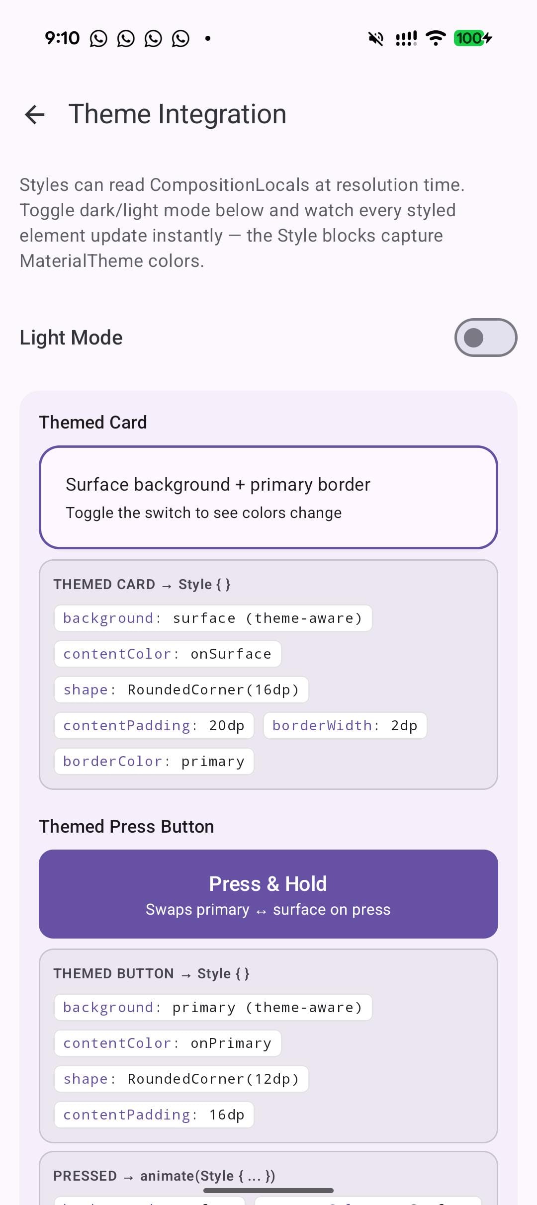
One concern I had going in: can styles read the current theme? If they are static objects, they would not respond to dark mode toggles. Turns out, StyleScope extends CompositionLocalAccessorScope, which means you can read any CompositionLocal inside a Style {} block.
val primary = MaterialTheme.colorScheme.primary
  val onPrimary = MaterialTheme.colorScheme.onPrimary
  val surface = MaterialTheme.colorScheme.surface
  val onSurface = MaterialTheme.colorScheme.onSurface

  val buttonStyle = Style {
      background(primary)
      contentColor(onPrimary)
      shape(RoundedCornerShape(12.dp))
      contentPadding(16.dp)
      pressed {
          animate {
              background(surface)
              contentColor(onSurface)
              scale(0.95f)
          }
      }
  }
Toggle dark mode. The button updates its colors immediately. No extra wiring. The Style {} block captures the CompositionLocal values, and when the theme changes, the style recomposes with the new values. This is how it should work, and I was relieved it did.
What you learn:
StyleScopeextendsCompositionLocalAccessorScope. You can readMaterialTheme.colorScheme,LocalContentColor, or any customCompositionLocalinside a Style block.- Styles react to theme changes automatically. Swap light to dark, and the style picks up the new palette.
- No
isSystemInDarkTheme()checks needed. No conditional style selection.
Lab 8: Custom components with style parameters
The API guidelines pattern: Defaults object + style parameter + .then() override.
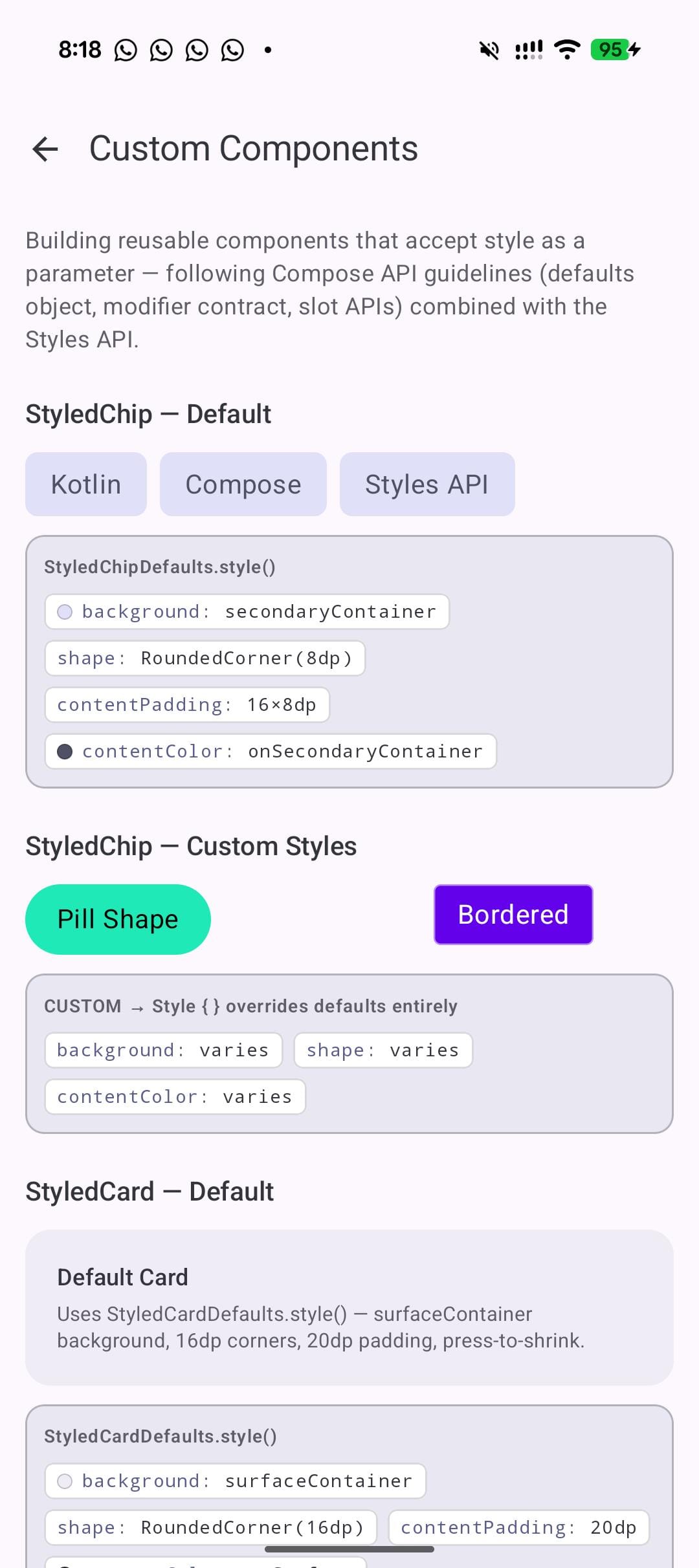
This is the lab that matters most for library authors and design system teams. The Compose team has published guidelines for how components should expose styling, and the pattern looks like this:
object StyledChipDefaults {
      @Composable
      fun style(): Style {
          val bg = MaterialTheme.colorScheme.secondaryContainer
          val fg = MaterialTheme.colorScheme.onSecondaryContainer
          return Style {
              background(bg)
              shape(RoundedCornerShape(8.dp))
              contentPadding(horizontal = 16.dp, vertical = 8.dp)
              contentColor(fg)
              pressed { animate { scale(0.95f) } }
          }
      }
  }

  @Composable
  fun StyledChip(
      onClick: () -> Unit,
      modifier: Modifier = Modifier,
      style: Style = StyledChipDefaults.style(),
      content: @Composable () -> Unit,
  )
The Defaults object provides a @Composable style() function that reads the theme. The component accepts a style parameter with the defaults as the default value. Callers who want to customize use StyledChipDefaults.style().then(Style { ... }) to override specific properties while keeping the rest.
This mirrors how Material3 components already work with colors, elevation, and contentPadding parameters, but collapses them all into a single style parameter. One parameter instead of five. One override mechanism instead of five separate Defaults functions.
Consider what this does to API surface. Today, a Material3 Button has colors, elevation, shape, contentPadding, and border parameters. Each has its own Defaults object and its own override pattern. With Styles, all of that collapses to one style parameter. Callers learn one override mechanism. Library maintainers expose one customization surface.
What you learn:
- Follow the same pattern as Material3: a Defaults object with a
@Composable fun style()that reads theme values. - Callers override with
style = StyledChipDefaults.style().then(Style { ... }). They get the base behavior plus their customizations. - If you are building a component library, start designing your APIs around this pattern now.
What I learned building 8 labs
Here are the six things that stuck with me.
- MutableStyleState is non-negotiable in alpha06.
If you use Modifier.styleable(style = myStyle) and expect checked() or selected() to just work when paired with toggleable(), they won't. This is by design – earlier alphas had auto-detection but it conflicted with the interactionSource on clickable/toggleable.
You create a MutableStyleState, share the MutableInteractionSource, and explicitly set styleState.isChecked or styleState.isSelected` yourself. The clickable/interactionSource/ripple integration is being reworked, so expect this to evolve.
For pressed state specifically, share the InteractionSource:
val src = remember { MutableInteractionSource() }
val ss = remember { MutableStyleState(src) }
Box(
    Modifier
        .styleable(styleState = ss, style = myStyle)
        .clickable(interactionSource = src, indication = null) { }
)
If your styles aren't responding to state, this is almost certainly why.
- Style composition is the real win.
The individual style properties are convenient. The state blocks are nice. But .then() composition is what turns this into a design system tool. Define your tokens as styles. Compose them. Override selectively. This is the pattern that scales from a demo app to a production system.
- Some things do not work yet.
dropShadow() exists in the API surface but has an internal constructor. I could not use it. Some properties appear in autocomplete but do not render visibly. This is alpha software. Ship your experiments in debug builds, not your production APK.
contentColorpropagation works well.
Set contentColor() on a parent style, and child Text and Icon composables pick it up through LocalContentColor. This is not new behavior for Compose, but having it work through the Style system means you define your icon and text colors once in the style, not on each child. For the favorite button in Lab 5, the icon color changes from gray to red purely because the parent style switches contentColor in the checked() block.
- Theme integration works.
I was worried styles might be static and disconnect from CompositionLocal values. They don't. StyleScope extends CompositionLocalAccessorScope, so you read MaterialTheme.colorScheme.primary inside a Style {} block and it recomposes when the theme changes. Dark mode works. Custom themes work.
- Where this is headed.
Looking at the full API surface, this looks like Compose's answer to CSS-in-JS. A declarative styling system with state variants, composition, animation, and theme integration. When it reaches stable, it could change how component libraries are built. The pattern in Lab 8, where a component exposes a single style parameter with composable defaults, is cleaner than the current Material3 approach of separate colors, elevation, shape, and contentPadding parameters.
The caveat is obvious: this is alpha. The API surface could change. MutableStyleState behavior will almost certainly evolve. Property names might shift. But the direction is clear, and the developer experience in these eight labs, once I worked around the alpha06 bugs, was better than the InteractionSource approach.
I think the .then() composition and the Defaults object pattern from Lab 8 will be the most impactful features when this stabilizes. Not because they're flashy. Because they give Compose a real answer to something annoying since 1.0: how do you let callers override a component's look without exposing five separate parameters?
Try it yourself
The full source for all eight labs is on GitHub: Compose Style Lab. Clone it, run it, tap things. Every lab has live toggles, property readouts, and state controls. Break the styles. Compose new ones. The best way to learn this API is to play with it.
To use the Styles API in your own project, add compose-foundation:1.11.0-alpha06 (or newer) and opt in with @OptIn(ExperimentalFoundationStyleApi::class).
P.S - If you build something with the Styles API, I'd like to see it.